
 Search for...
 English
 Español
 Deutsch
 中文简体
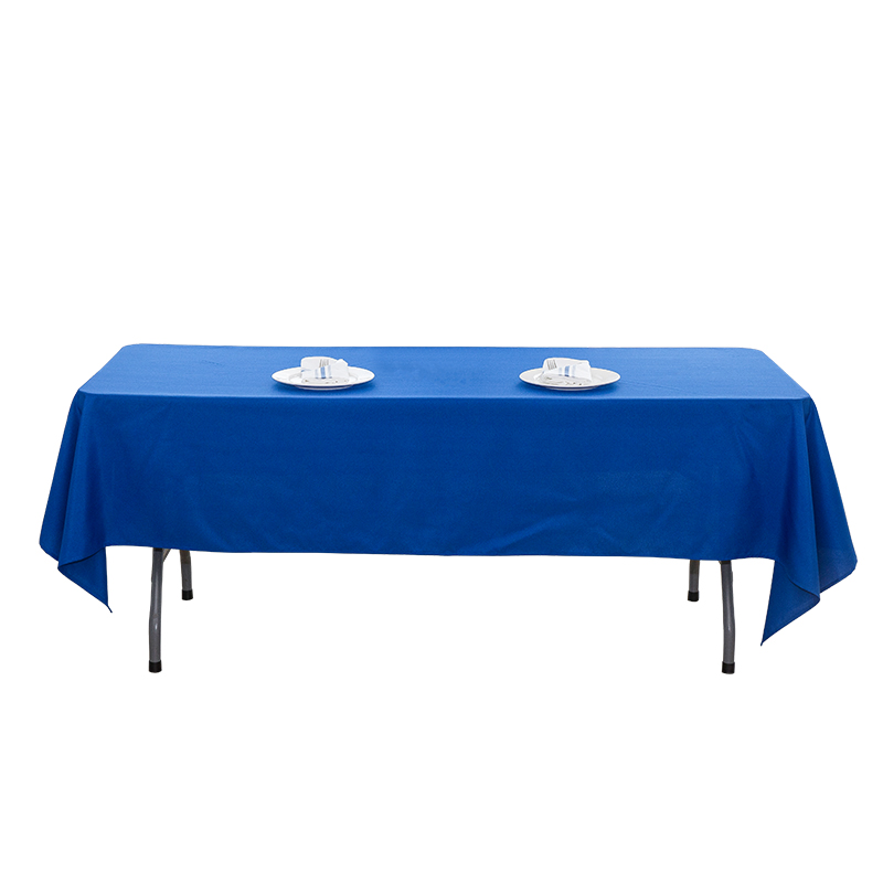
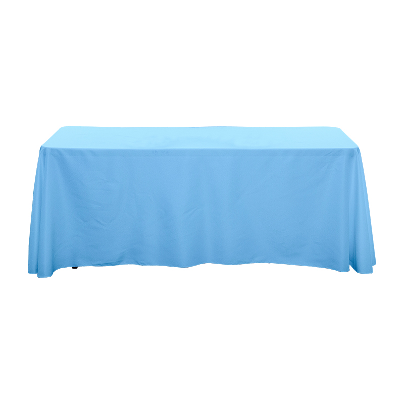
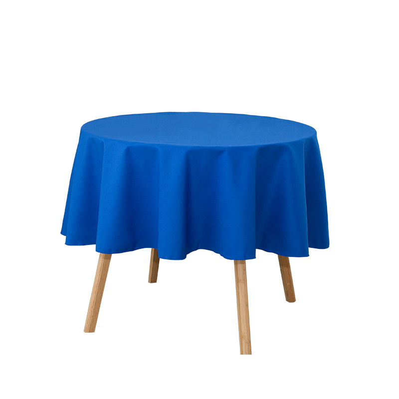
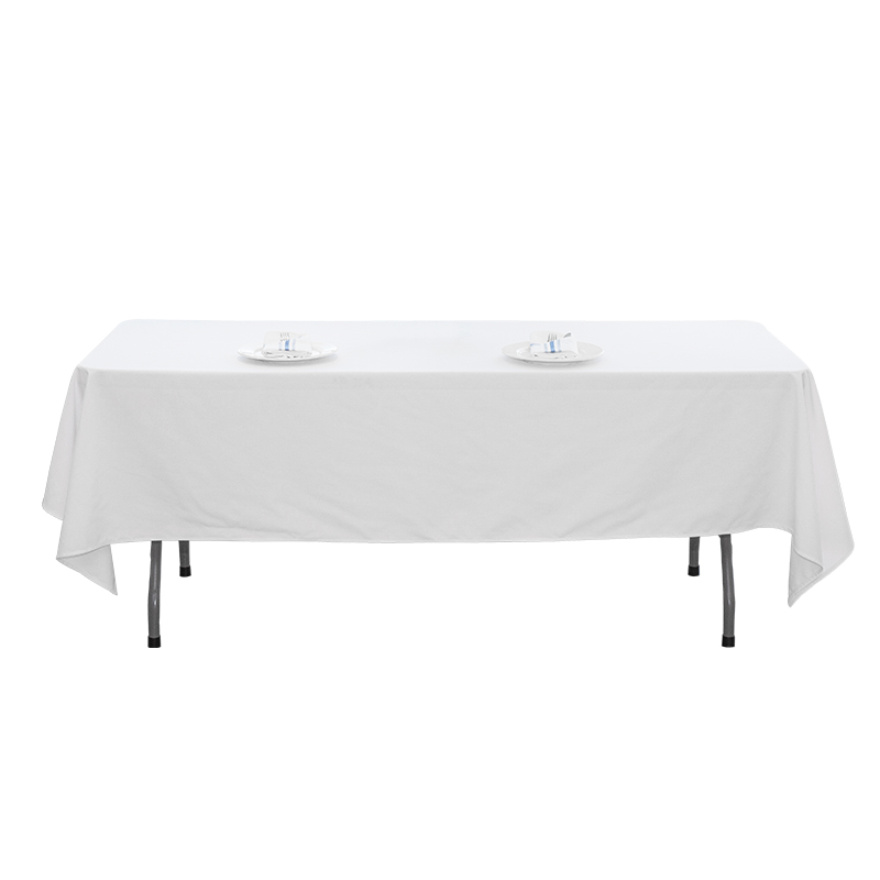
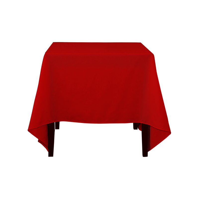
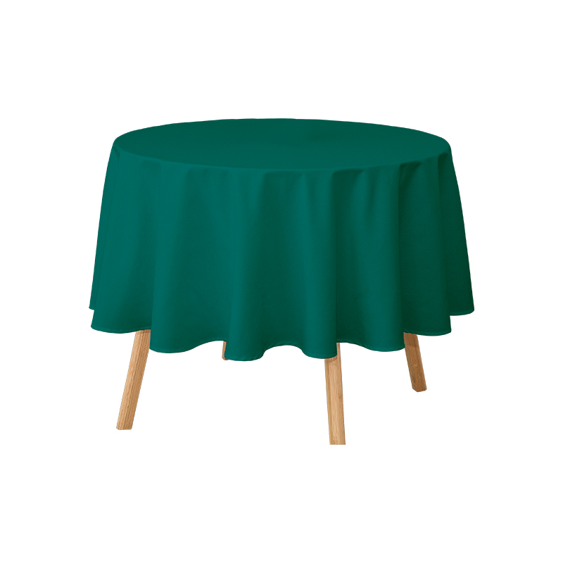
60x102'' 217gsm Polyester Solid Color Wedding Banquet Tablecloth

Choosing the perfect printed tablecloth to match your dining room theme can completely transform the look and feel of your space. Whether you are decorating for everyday use or a special occasion, the right tablecloth enhances your décor and creates a harmonious atmosphere.
The first step in matching a printed tablecloth is to clearly define your dining room style. Common styles include:
Example Tablecloth Match by Style:
| Dining Room Style | Suggested Tablecloth Patterns | Color Palette |
|---|---|---|
| Modern Minimalist | Geometric, abstract, simple lines | Black, white, gray, muted tones |
| Rustic / Farmhouse | Gingham, floral, plaid | Earth tones, soft pastels |
| Vintage / Classic | Baroque, lace, floral | Cream, gold, deep colors |
| Coastal / Nature | Leaves, seashells, botanical | Blues, greens, soft neutrals |
Color plays a critical role in creating a cohesive dining room. Here are some strategies:
The size of the print on your tablecloth can dramatically influence the visual balance of your dining room:
A printed tablecloth should complement, not compete with, your dishes, placemats, and napkins:
The material affects both the aesthetics and practicality of your tablecloth:
| Material | Best For | Advantages |
|---|---|---|
| Cotton / Linen | Casual, rustic, everyday use | Natural texture, breathable, soft |
| Polyester / Coated | Daily use, families with kids | Easy to clean, stain-resistant |
| Silk / Premium Fabric | Formal events, holidays | Luxurious appearance, elegant feel |
Adding layers can make a printed tablecloth even more visually appealing:





No.1858 Jintong Road, Tongzhou District, Nantong City, Jiangsu Province, China

+86-15201926659
+86-513-85533330

nthq@huaqintex.com
cath@huaqintex.com
alice@huaqintex.com
